About The Author- Fatima Mughal
I am a traditional artist who goes by the name “Fate”. If there’s one important lesson I’ve learned during my artistic journey, it would be “Do not underestimate the power of networking and storytelling.” I have raised in Middle East if anyone lined there must know the amazing art supplies which are easily available in the Middle East. My parents since childhood provided the best art supplies to us such as Pelikan & Faber Castle.
My Art Journey
Drawing and painting used to be a shared hobby among my siblings and me. However, I never thought I would become an artist like I am today. That all changed in 2015 when a life-changing moment occurred. My cousin, an art enthusiast, came across a sketch which I made from YouTube tutorial just for fun. Two days later, he surprised me with a set of drawing pencils and a sketch pad. One statement of encouragement, one eye recognizing talent, one supportive gesture – all changed my life’s trajectory. A true ‘butterfly effect.’
My Learning Inspiration!
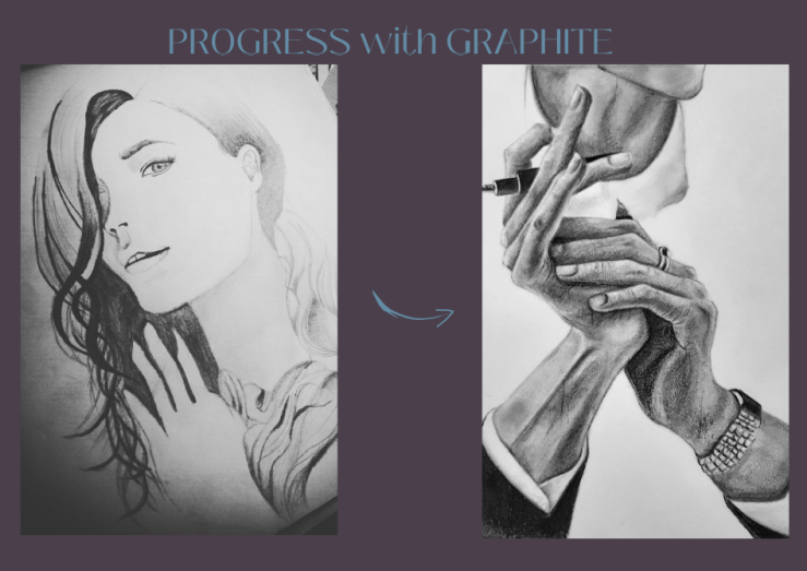
For starters I’d highly recommend practicing with the book “Drawing the head and hands by Andrew Loomis” instead of just copying sketches. Save your time, learn the basics quickly. Here’s the link to the free e-book: https://www.booksfree.org/drawing-the-head-and-hands-by-andrew-loomis-pdf-free-download/
Initially, I experimented with watercolors, but after discovering my favorite acrylic artist, ColorbyFeliks, I transitioned to using acrylics. However, nowadays I am primarily focused on using oils, and I confess to being quite obsessed with them.
When you are diving into the world of painting, You Must know the Colour theory, Colour Psychology and Effective use of Colours to better express yourself.
Colour theory, colour psychology, and the effective use of colours in artwork are essential aspects of creating visually engaging and emotionally resonant art. Let’s dive into each of these topics:
Colour Theory
Colour theory is the study of how colours interact with one another and the principles behind colour mixing. It’s crucial for artists to understand the fundamentals of colour theory, which include:
Primary Colours: These are the basic colours that cannot be created by mixing other colours. In traditional colour theory, primary colours are red, blue, and yellow.
Secondary Colours: These colours are created by mixing equal parts of two primary colors. For example, mixing red and blue creates purple.
Tertiary Colours: These colours result from mixing a primary colour with a neighbouring secondary colour. Examples include red-orange or yellow-green.
Colour Wheel: A colour wheel is a visual representation of how colours relate to one another. It helps artists understand colour harmonies and combinations.
Colour Temperature: Colours can be warm (e.g., red, orange) or cool (e.g., blue, green). Understanding colour temperature can convey mood and atmosphere in art.
Colour Psychology:
Colour psychology explores the emotional and psychological effects of colours on individuals. Different colours can evoke various emotions and associations. Artists use colors to evoke emotions and convey their personal or cultural experiences. Warm colors like red and orange may be used to create a sense of energy, vibrancy and passion, whereas cool colors like blue and green can reflect calm and tranquility.
Cultural differences can influence how these emotional responses are interpreted. What may be seen as soothing in one culture may be perceived as cold or distant in another. Historical and religious factors can shape the color choices in art. In religious art, colors may have specific religious significance and be used to convey spiritual messages.
Artists often draw upon these cultural associations to convey deeper layers of meaning in their work. This can involve using colors to symbolize cultural values, traditions, or historical events.
Artists can use colour psychology to intentionally evoke specific emotions or create a certain mood in their artwork.
Effective Use of Colours in Artwork:
To effectively use colours in artwork, consider these tips:
Colour Harmony: Choose colour schemes that create visual harmony. Common schemes include complementary (opposite colours on the colour wheel), analogous (colours next to each other on the wheel), and triadic (three evenly spaced colours).
Balance: Balance the use of colours in your composition. While a balanced palette creates visual interest, but monochromes can reflect your desired mood and effect. It’s more subjective opinion how you want to balance the use of colours.
Focal Point: Use colour to guide the viewer’s eye to a focal point within your artwork. Vibrant or contrasting colours can draw attention.
Symbolism: Be aware of the cultural and psychological associations of colours and use them to convey your intended message or story.
Experiment: Don’t be afraid to experiment with colour. Break traditional rules to create unique and innovative artwork.
Context: Consider the context in which your artwork will be viewed. Colours may appear differently in various lighting conditions.
Incorporating colour theory and colour psychology into your art can elevate its impact and meaning, making it more engaging and thought-provoking for viewers. Whether you’re a painter, graphic designer, or any type of artist, understanding the language of colour is a valuable skill.
Join me on social media…I hope u will connect, exchange tips and ideas. Looking forward to making new friends!